Lessons
4 & 5
Representing and interpreting data
Representing data with a scale of 1
A bar graph is a way to represent data visually.
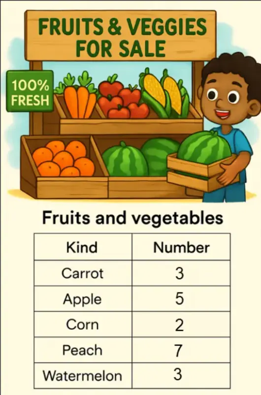
• The following table shows the numbers of fruits and vegetables at the farm stand.
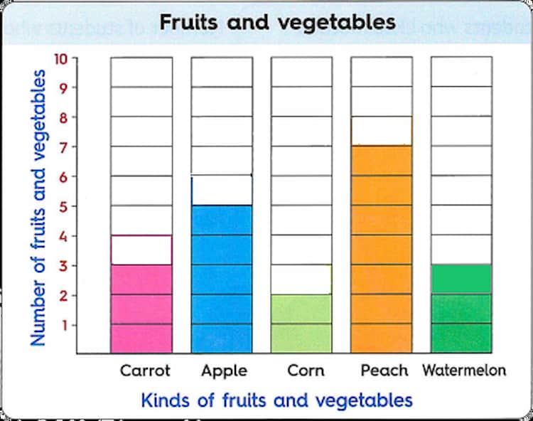
• The following bar graph represents the same data with a scale of 1.
Reading a bar graph gives you information.
Here are some information from the opposite bar graph :
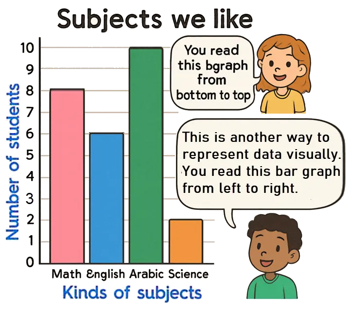
- The subject which liked the least is science.
- The subject which liked the most is Arabic.
- The number of students who liked math and English is 14.
Think
You can add to solve a problem.
8 + 6 = 14
- The number of students who liked more Arabic than science is 7.
Think
You can subtract to solve a problem.
10 - 3 = 7
- The number of students who liked math, English and Science is 16.
Think
You can add to solve a problem.
8 + 6 + 2 = 16
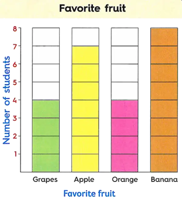
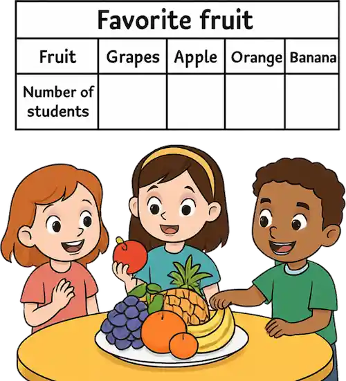
Answer the following questions.
a. How many students liked grapes ?
b. How many students liked apple ?
c. Which fruit is liked the most ?
d. How many students in all liked apple and orange ?
e. How many students in all liked grapes and banana ?
f. How many students liked banana more than grapes ?
g. How many students in all liked orange and grapes ?
h. How many students liked apple more than orange ?
Notes for parents
- Encourage your child to explain how to convert the data from the table into a bar graph.
- Ask them to find the most and least popular items in the bar graph.
- Help your child describe the information they see in the graph and answer questions about it.
- Let your child decide whether to use addition or subtraction to solve the problems on this page.